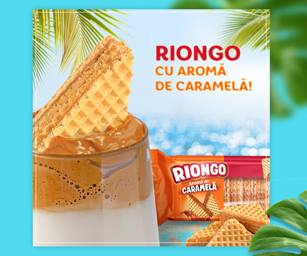
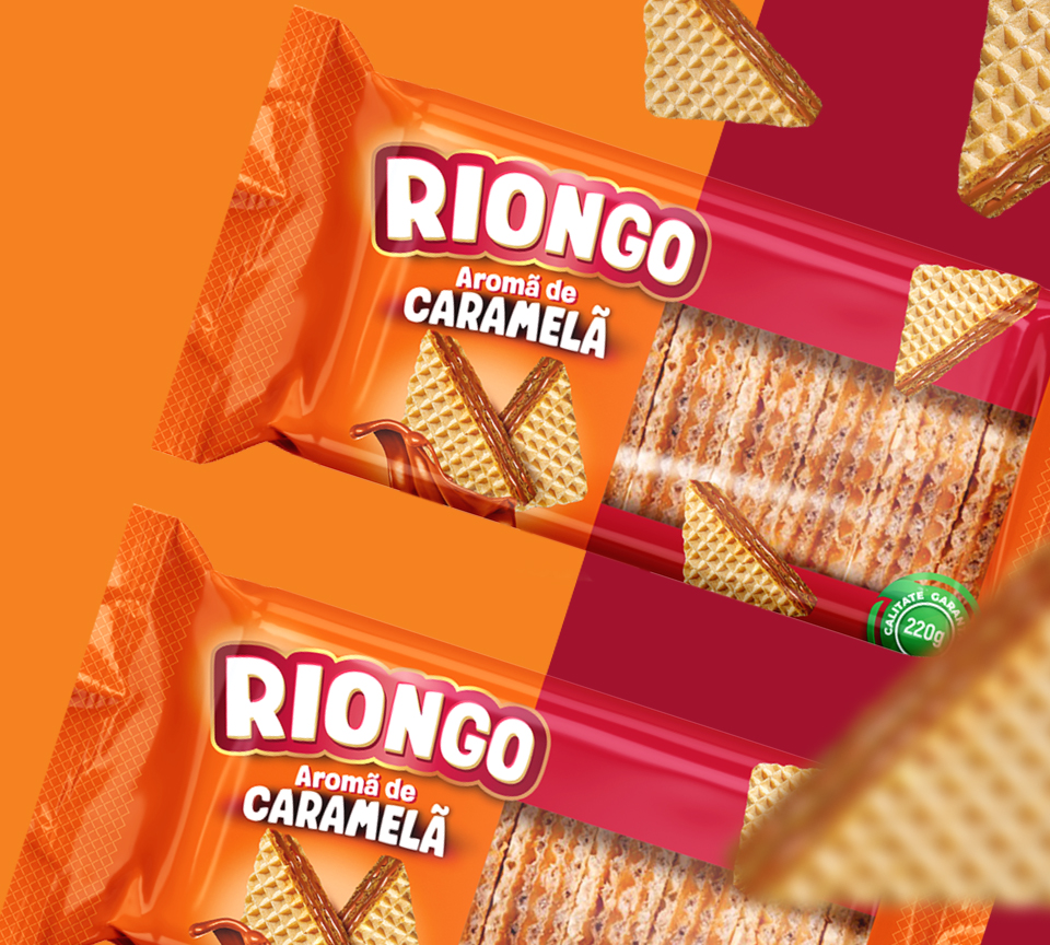
Riongo – a crisp and passionate story.
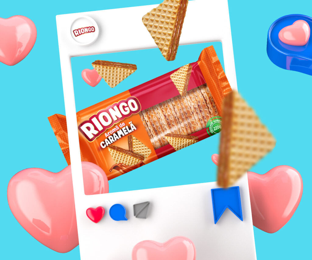
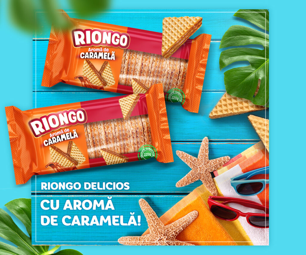
Fine and crispy wafers, with a caramel flavour, that captivate you from the first bite. Mmm… the taste buds are exploding and the body is buzzing with pleasure…
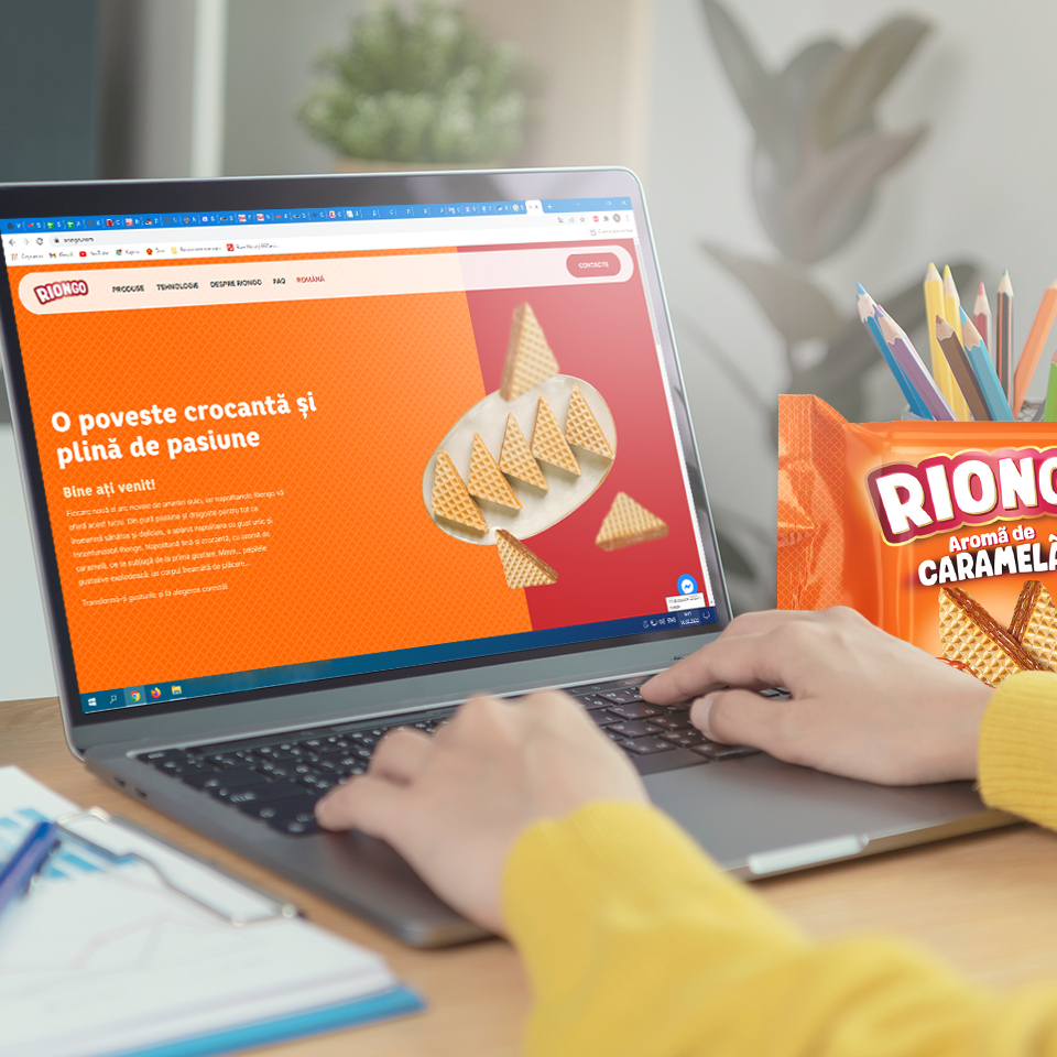
Visit the website
Web development
A website represents, first of all, the differentiation of a trademark from competitors
… and also, the most accurate representation of personal style and the most detailed description of the product, so that the customer appreciates both the visual and the informational aspects of the pages – this was the strategy followed at Riongo.
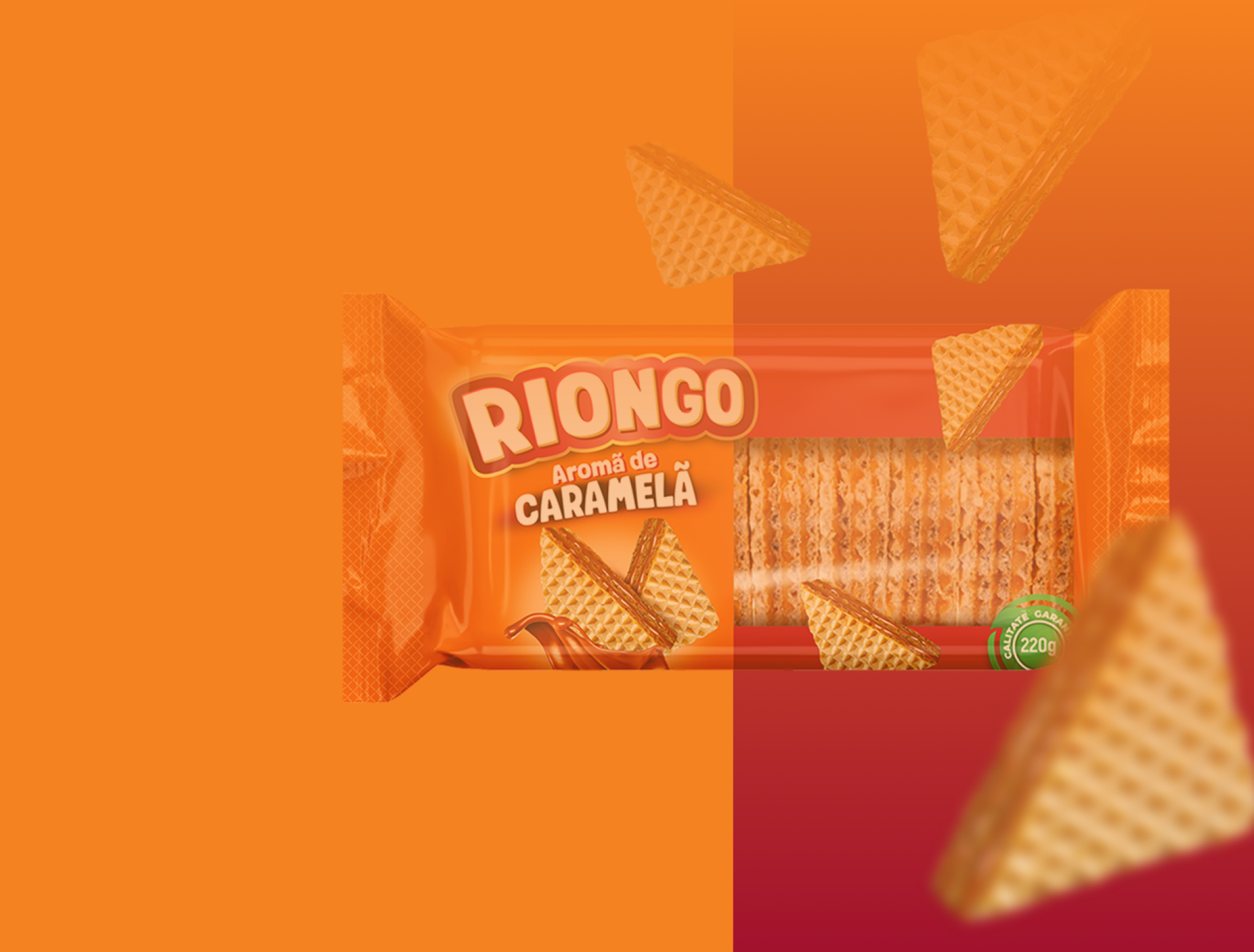
Packaging design
Colour – calling memories and nostalgia
Colour is the easiest and most advantageous way to convey a message to consumers. Proceeding from this idea, the first thing we have drawn attention to was the colour. We have chosen the combination of orange and burgundy.


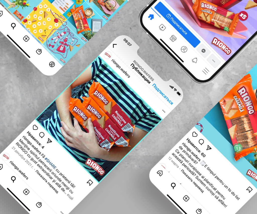
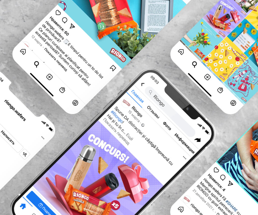
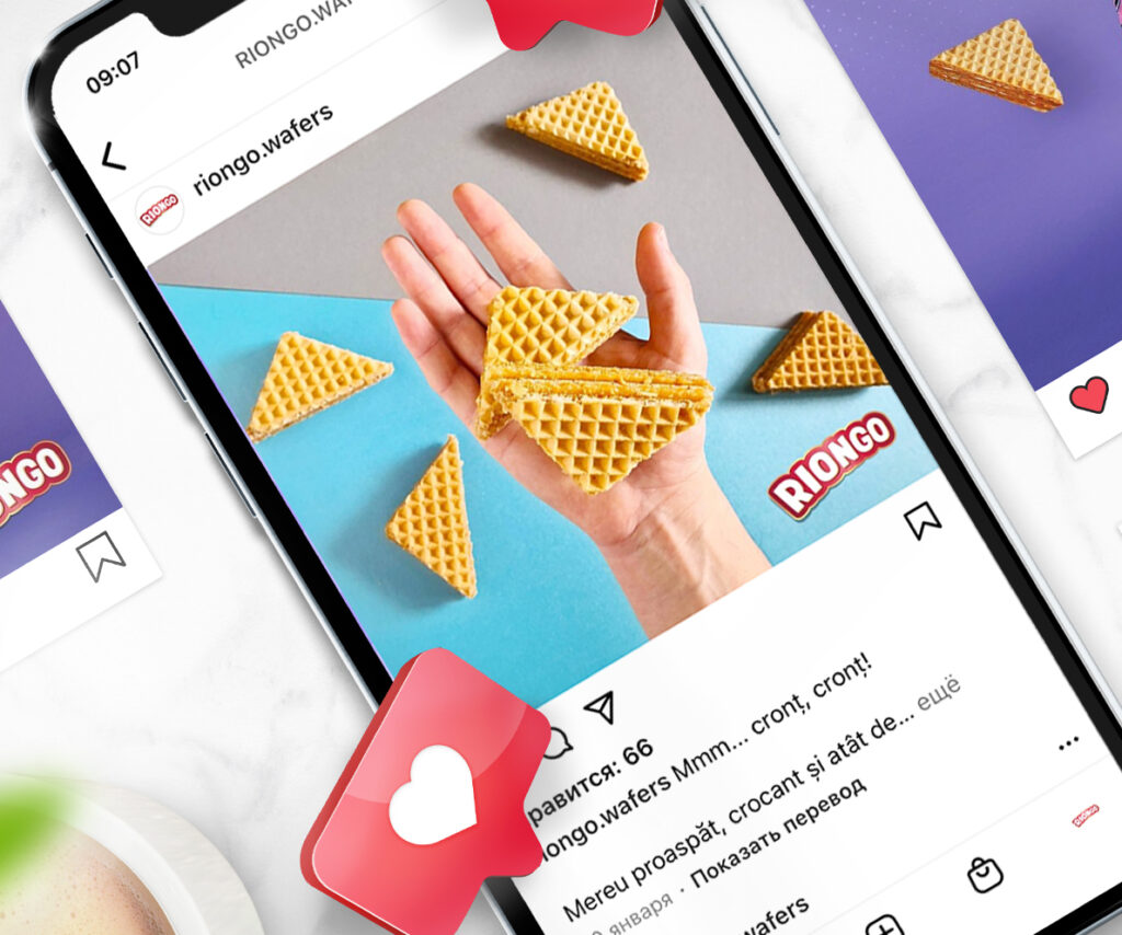
Instagram

TikTok

Facebook

Social media
A brand that promotes a different concept in the snack market
We develop an integrated campaign in the online environment by implementing all the agency’s services. And something more 🙂